
FEMA
FEMA Case Study
Information Architecture
〰️
Navigation Design
〰️
UX Design
〰️
UI Design
〰️
Prototyping
〰️
User Testing
〰️
Information Architecture 〰️ Navigation Design 〰️ UX Design 〰️ UI Design 〰️ Prototyping 〰️ User Testing 〰️
The Challenge
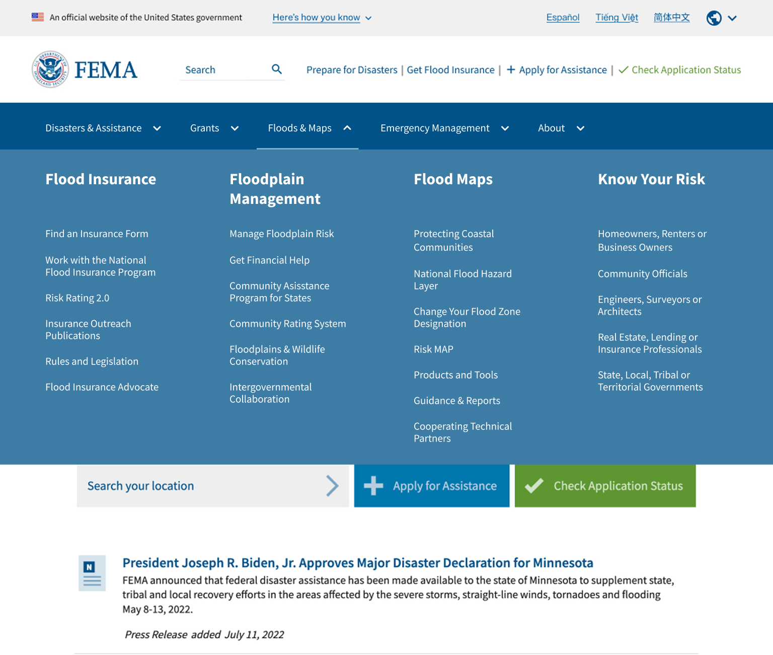
FEMA came to our team to rethink their flood maps and floodplain management sections of their website. Specifically, they wanted a new Information Architecture, revised content strategy, and net new pages about coastal resources.
Navigation & User Testing
In close collaboration with the content strategy team, we restructured the information architecture for FEMA's flood maps and floodplain management sections. I partnered with the research team to facilitate usability testing, where real users navigated a clickable prototype to validate whether the restructured content and navigation helped them find what they needed. Synthesizing user feedback, I refined and redesigned the navigation for this portion of FEMA’s website.
Content Strategy & Redesign
Working alongside the content strategy team, I redesigned the web pages within the flood maps and floodplain management sections, adhering to FEMA's strict design system. Our updated research directly informed every design decision, with careful attention paid to content hierarchy — ensuring the information on each page was relevant, easy to find, and intuitive to interact with.