PHAB
Public Health Accreditation Board Case Study
User Research
〰️
UX Design
〰️
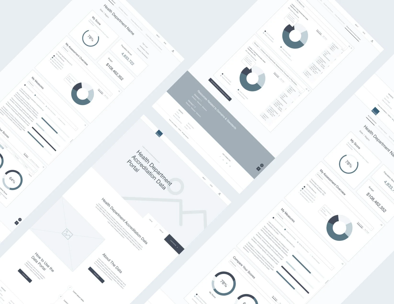
Wireframes
〰️
Data Visualizations
〰️
Prototype
〰️
User Testing
〰️
User Research 〰️ UX Design 〰️ Wireframes 〰️ Data Visualizations 〰️ Prototype 〰️ User Testing 〰️
The Challenge
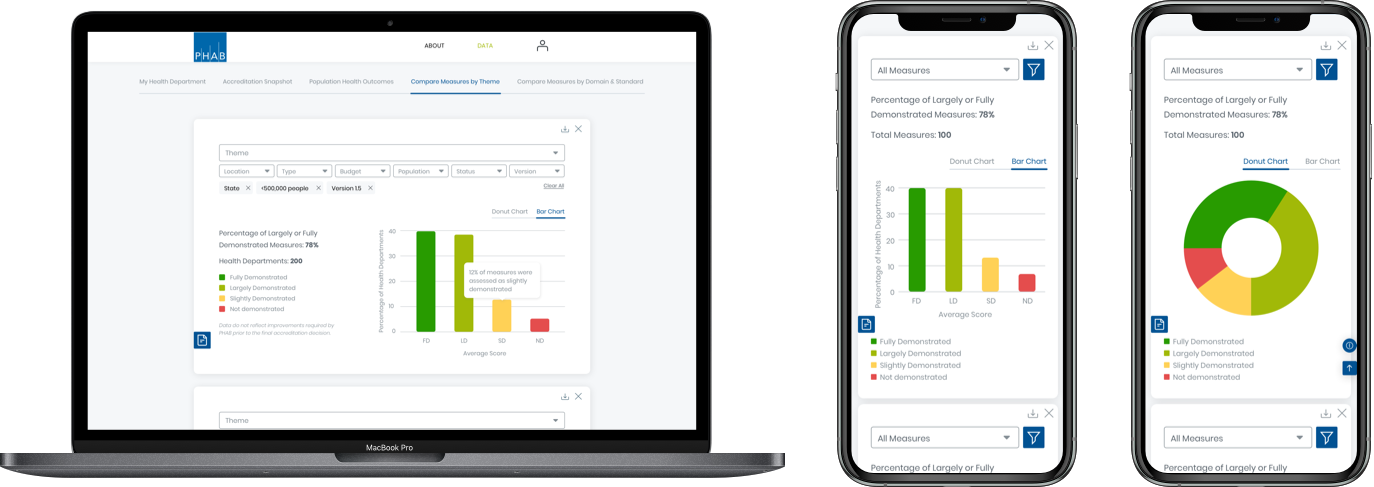
The Public Health Accreditation Board (PHAB) has ample data on 462 accredited health departments, but did not have a way to visually share this data with accredited health departments or the public. I was challenged to create a data visualization portal for health departments to visualize their relevant data and compare their performance against other departments.
The Process
As the lead UX designer, I partnered directly with the Public Health Accreditation Board (PHAB) and health departments to conduct an analysis of complex public health data and translate it into a clear, accessible experience. I led all wireframing efforts across two distinct user groups — Public Health Institutions and the general public — designing filtering and customization capabilities that enabled each audience to surface the insights most relevant to them. I drove an iterative prototyping process, facilitating usability testing sessions with multiple Public Health departments to gather actionable feedback and continuously refine the portal's effectiveness and intuitiveness.
The Result
As the lead UX and UI designer, I delivered a comprehensive data portal empowering Public Health Departments to log in, visualize, filter, customize, and compare their data with ease. I created high-fidelity mockups that closely adhered to established brand guidelines to ensure a cohesive, professional visual identity throughout. From there, I built a fully interactive prototype used in real-world usability testing, and delivered a design system and style guide to ensure consistency, scalability, and a seamless handoff to development.